
Sketch Changelog Review
Sketch Changelog Review
Sketch Changelog Review
Changelog
Channels:
Engagement
High-level overview of the changes, improvements, and new features dividing by platform updates.
Engagement
High-level overview of the changes, improvements, and new features dividing by platform updates.
Engagement
High-level overview of the changes, improvements, and new features dividing by platform updates.
Readability
Concise descriptions with visuals encourage reading and let users delve deeper via links.
Readability
Concise descriptions with visuals encourage reading and let users delve deeper via links.
Readability
Concise descriptions with visuals encourage reading and let users delve deeper via links.
Subscription
Non-disruptive email subscription form
Subscription
Non-disruptive email subscription form
Subscription
Non-disruptive email subscription form
Personalization
Nice platform filter component
Personalization
Nice platform filter component
Personalization
Nice platform filter component
Consistency
Prominent "What's New" section, division on Mac, web and iOS apps.
Consistency
Prominent "What's New" section, division on Mac, web and iOS apps.
Consistency
Prominent "What's New" section, division on Mac, web and iOS apps.
Multimedia
Good use of images and videos.
Multimedia
Good use of images and videos.
Multimedia
Good use of images and videos.
Design
The clean design.
Design
The clean design.
Design
The clean design.
Delivery
Provide in-app access to a Changelog
Delivery
Provide in-app access to a Changelog
Delivery
Provide in-app access to a Changelog
Navigation
Easy to navigate between platforms updates and across the pages.
Navigation
Easy to navigate between platforms updates and across the pages.
Navigation
Easy to navigate between platforms updates and across the pages.
SEO
Changelogs are indexed by search engines.
SEO
Changelogs are indexed by search engines.
SEO
Changelogs are indexed by search engines.
Frequency
Approximately once a month.
Frequency
Approximately once a month.
Frequency
Approximately once a month.
Actionable
Contain ways to education and benefits.
Actionable
Contain ways to education and benefits.
Actionable
Contain ways to education and benefits.
Archive
Release Note and Versions archives are available on the page and in-app.
Archive
Release Note and Versions archives are available on the page and in-app.
Archive
Release Note and Versions archives are available on the page and in-app.
Multi-channel
Updates are distributed through various channels, including app, 'What’s New' and Release Notes for Mac, Twitter, blog, Community and YouTube.
Multi-channel
Updates are distributed through various channels, including app, 'What’s New' and Release Notes for Mac, Twitter, blog, Community and YouTube.
Multi-channel
Updates are distributed through various channels, including app, 'What’s New' and Release Notes for Mac, Twitter, blog, Community and YouTube.
Based on a book Release Notes People Actually Want to Read.
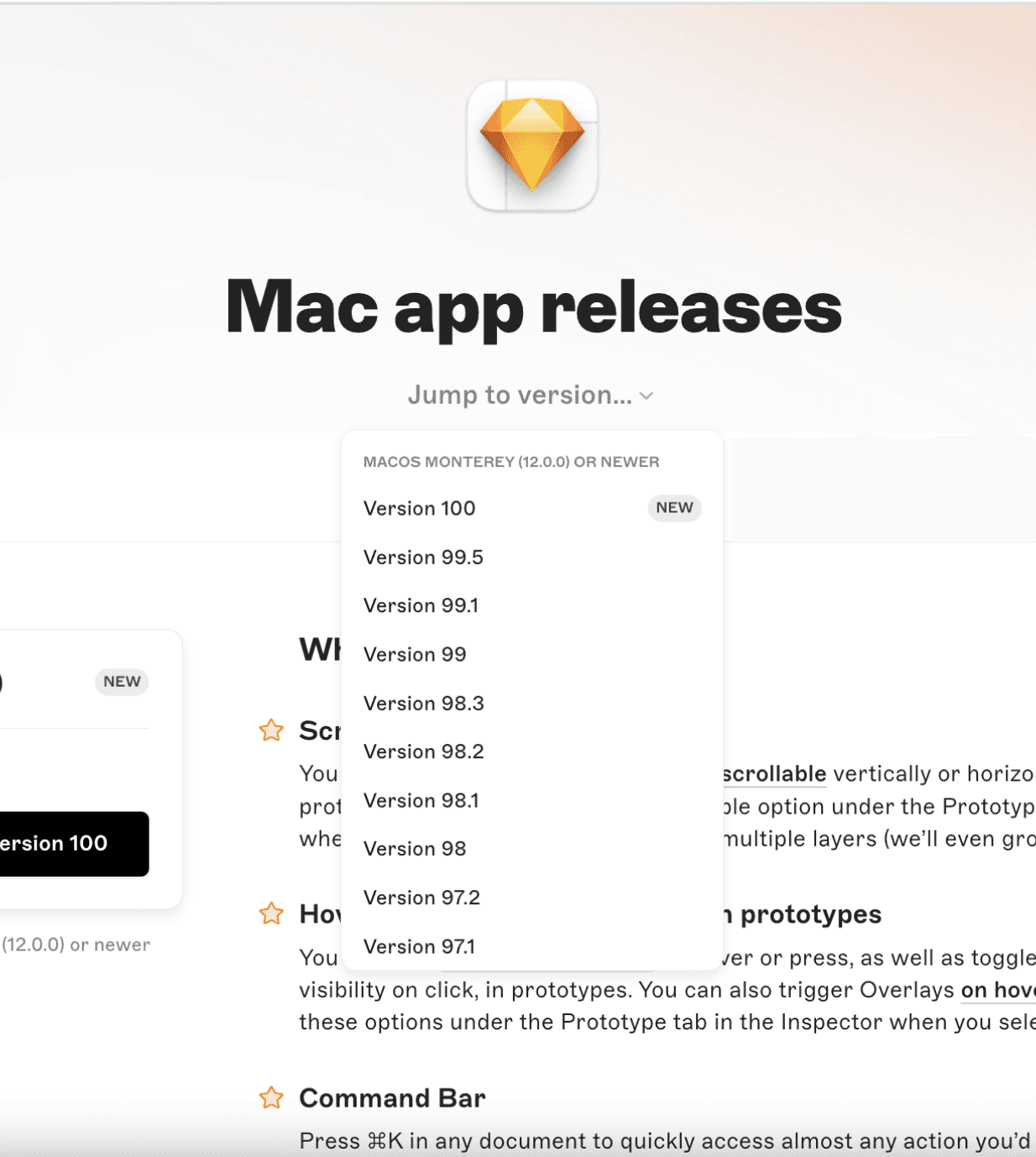
Sketch Changelog prioritize clean and simple design, offer user-friendly filtering based on platforms, and leverage illustrations and engaging videos to showcase updates. Additionally, the design ensures users are always aware of the current app version.





Lessons to Learn:
Sketch is a popular vector graphics editor developed for macOS and Figma’s alternative. It sets a great example with its approach to release notes and changelog.
Prioritize brevity and clarity in updates
Sketch uses a friendly and helpful tone of voice. New features, improvements, experimental features, and known issues are published on average once a month.
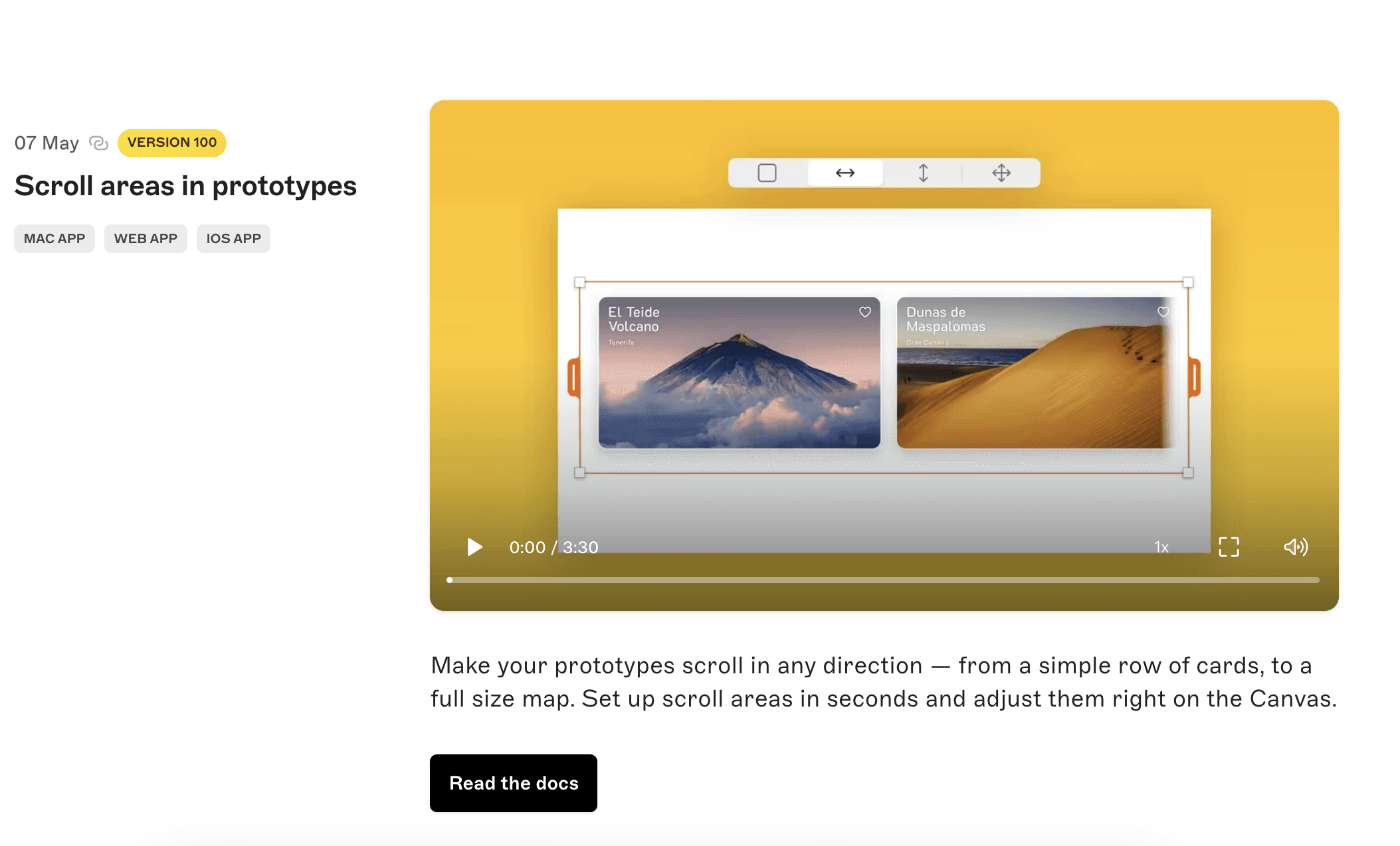
Each update provides a clear and short description, supported by videos. Not all users enjoy reading long release notes. This page aims to keep all features in one place for easy understanding.
Provide deep links to the feature
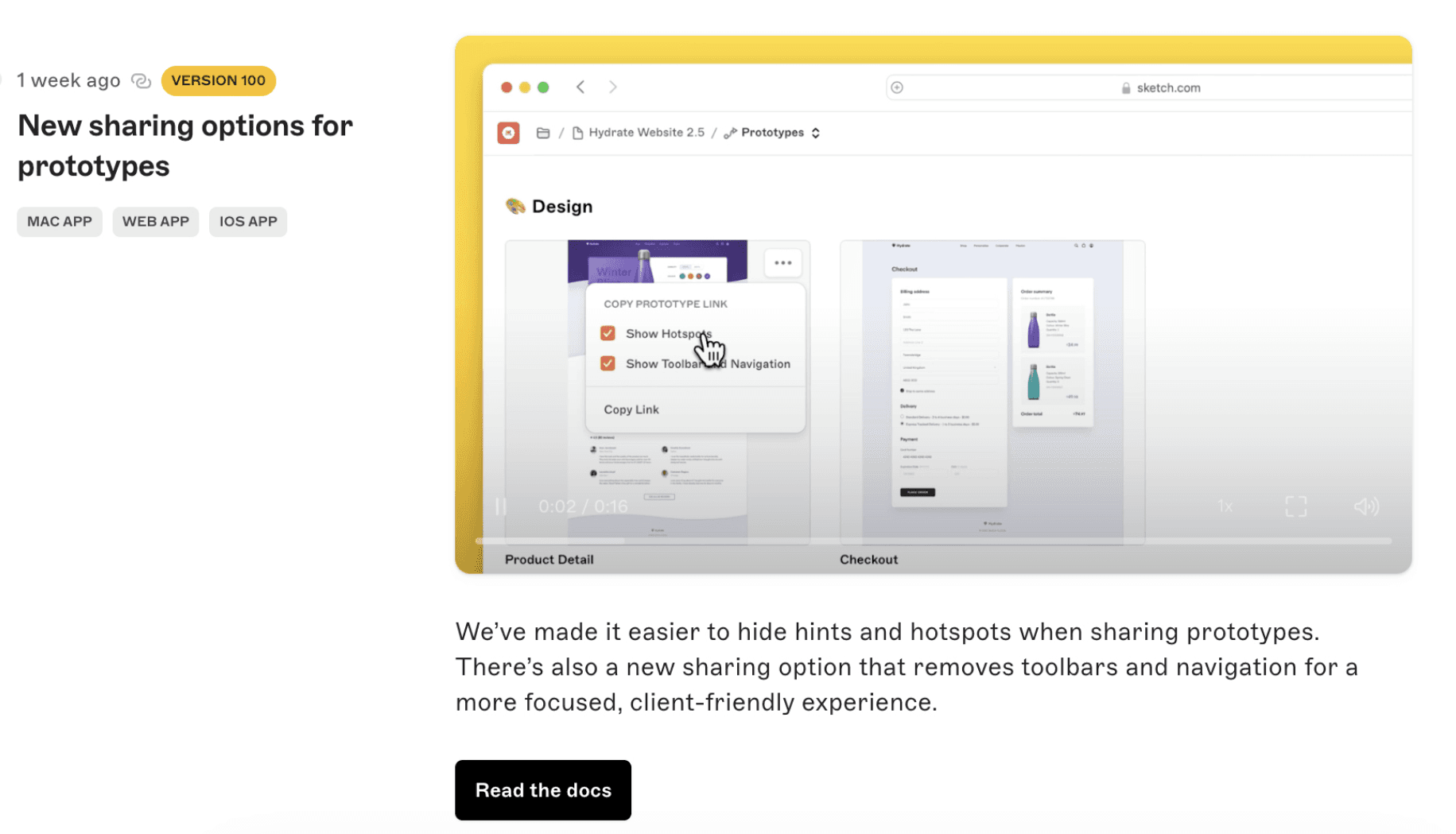
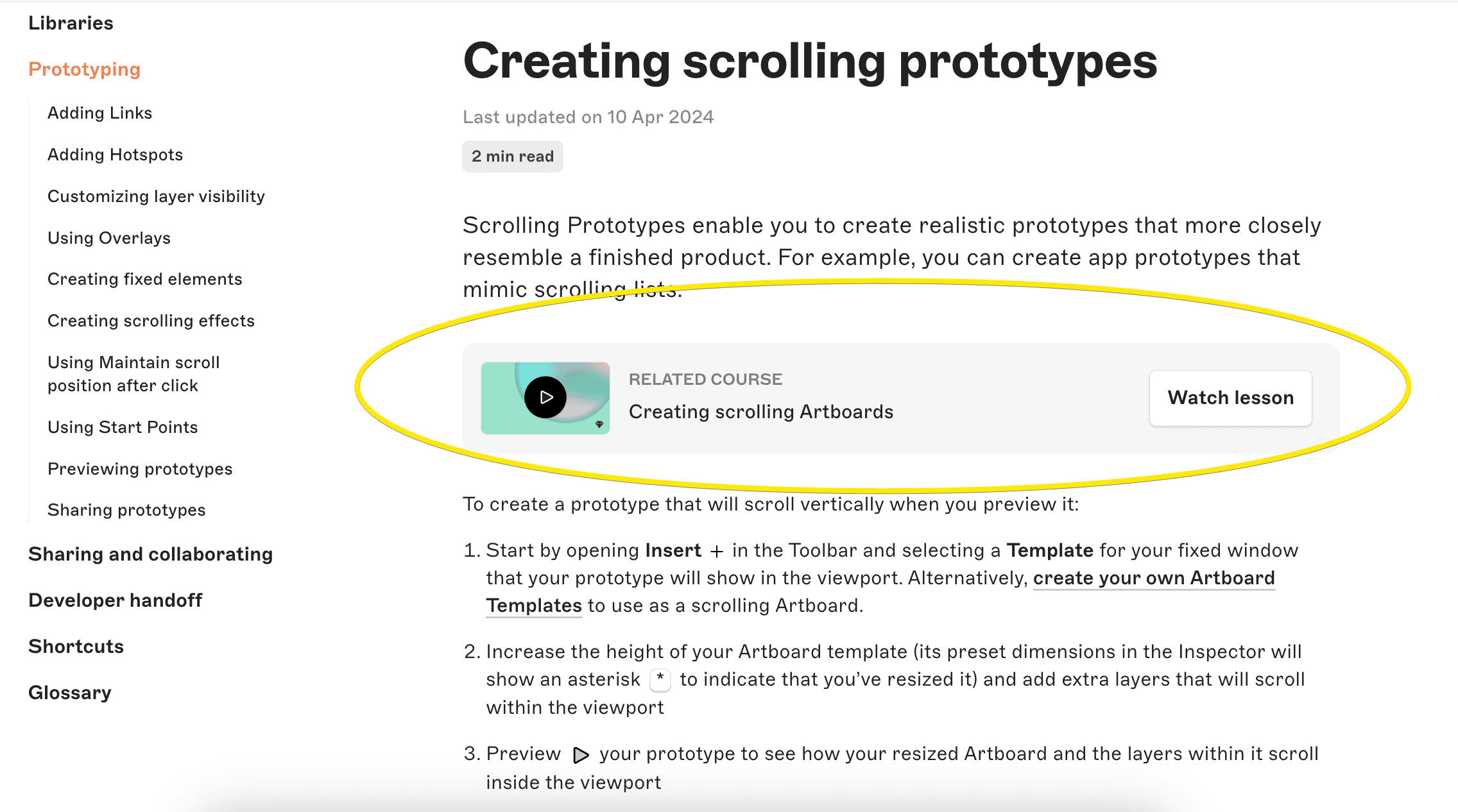
Though Sketch feature release note has a few sentences about the feature, it serves as a clear invitation to explore, learn, and leverage the platform features. Users can access this information by following links to detailed instructions, short videos and video lessons.
Separate Release Notes by app version and platform
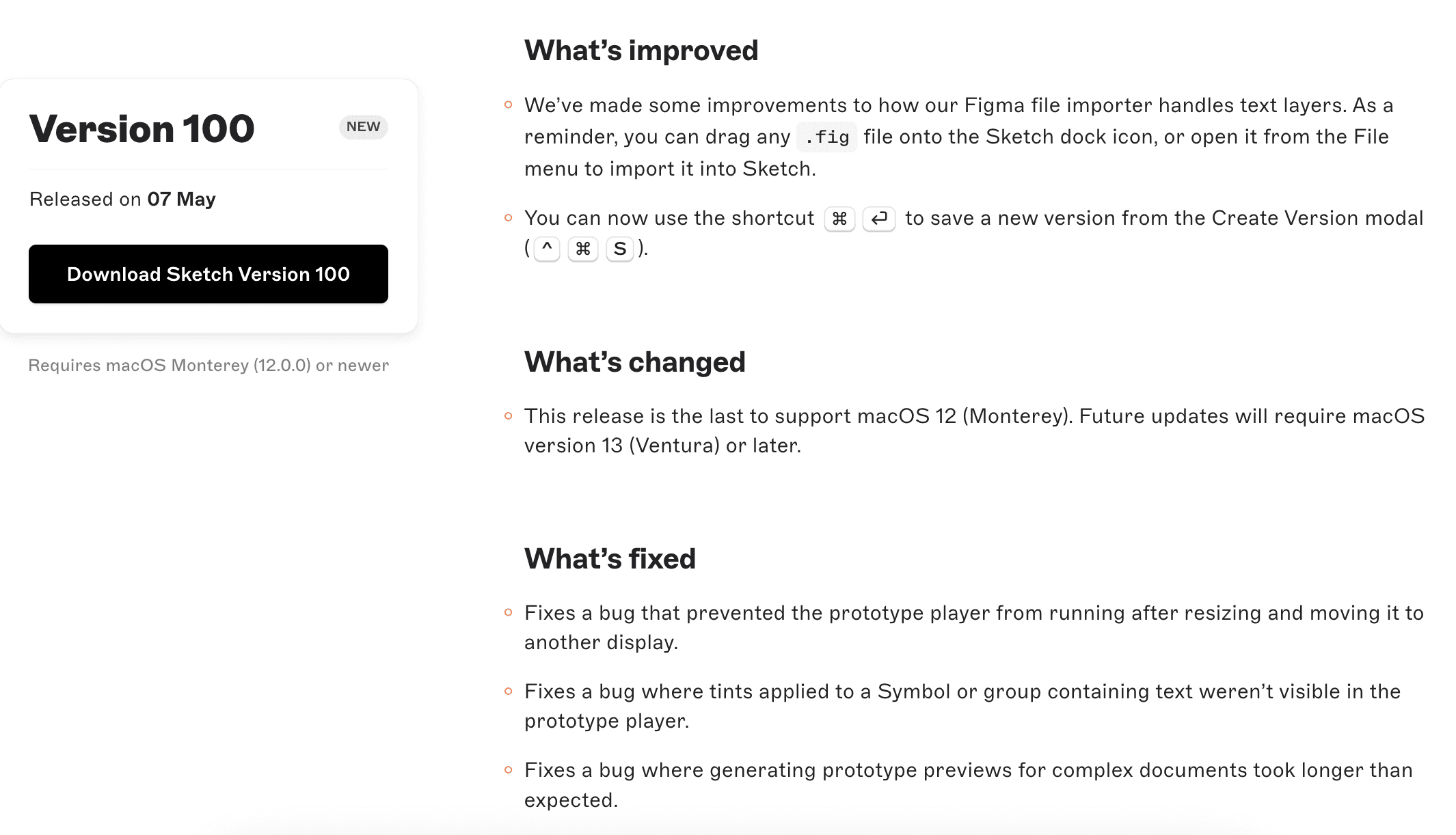
Sketch separates high level marketing updates from the Mac specific changelog, which contains all updates, changes, improvements and bug fixes. The updates are organized by version number, making it easy for users to find the relevant information. Unfortunately the changelog is more technical and can feel a bit "dry" due to the lack of images.
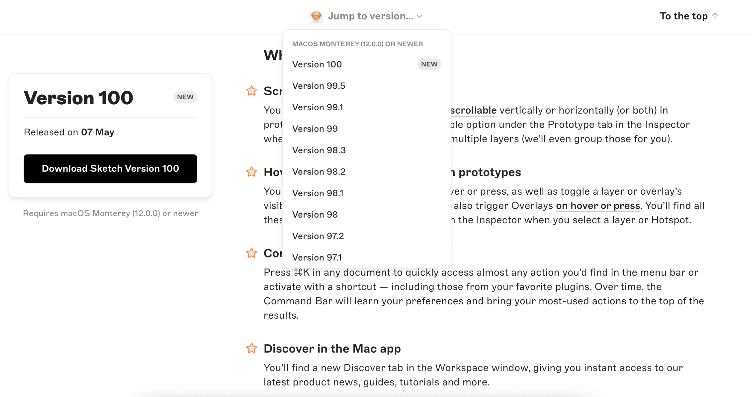
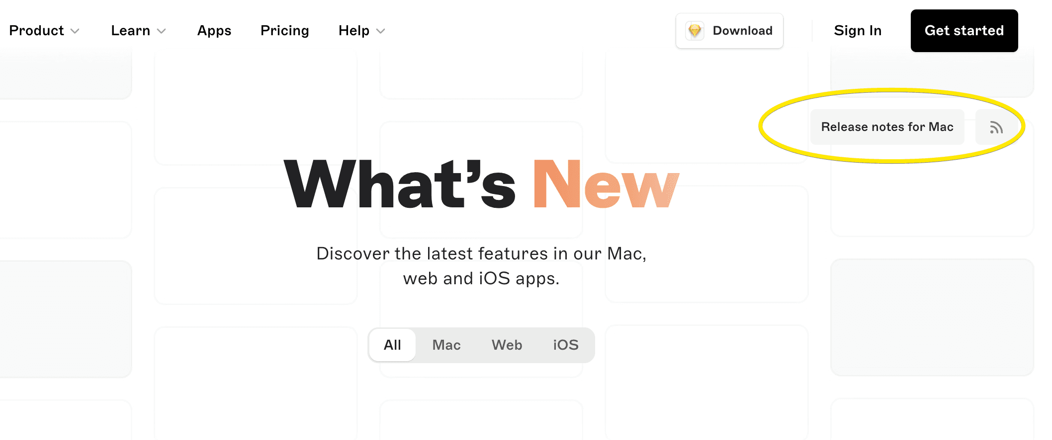
It’s also very easy to find the Release Notes for Mac only with the button, not only with a filter.
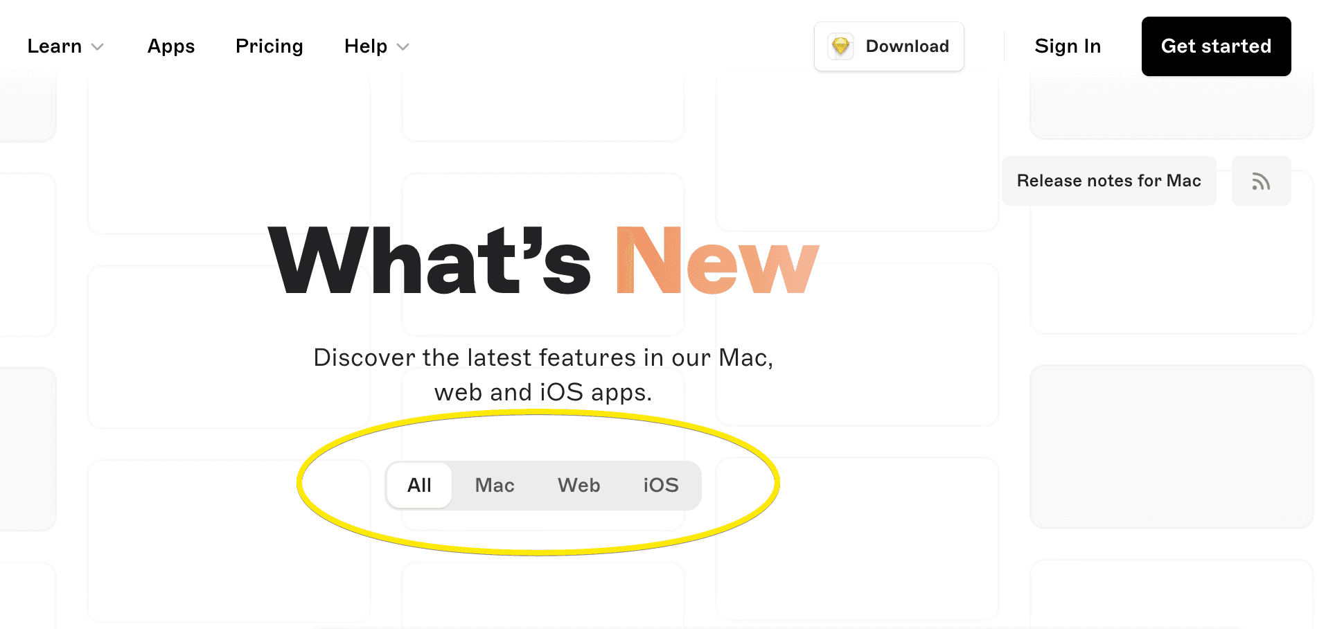
Use platform filters to simplify update searches
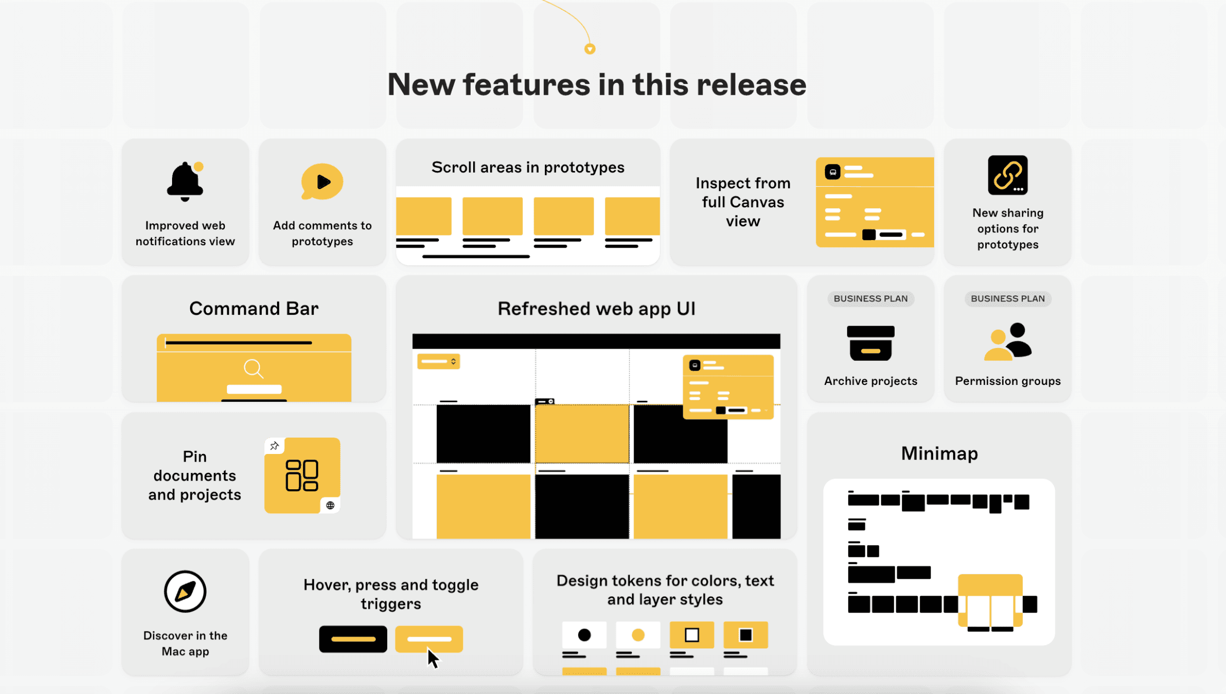
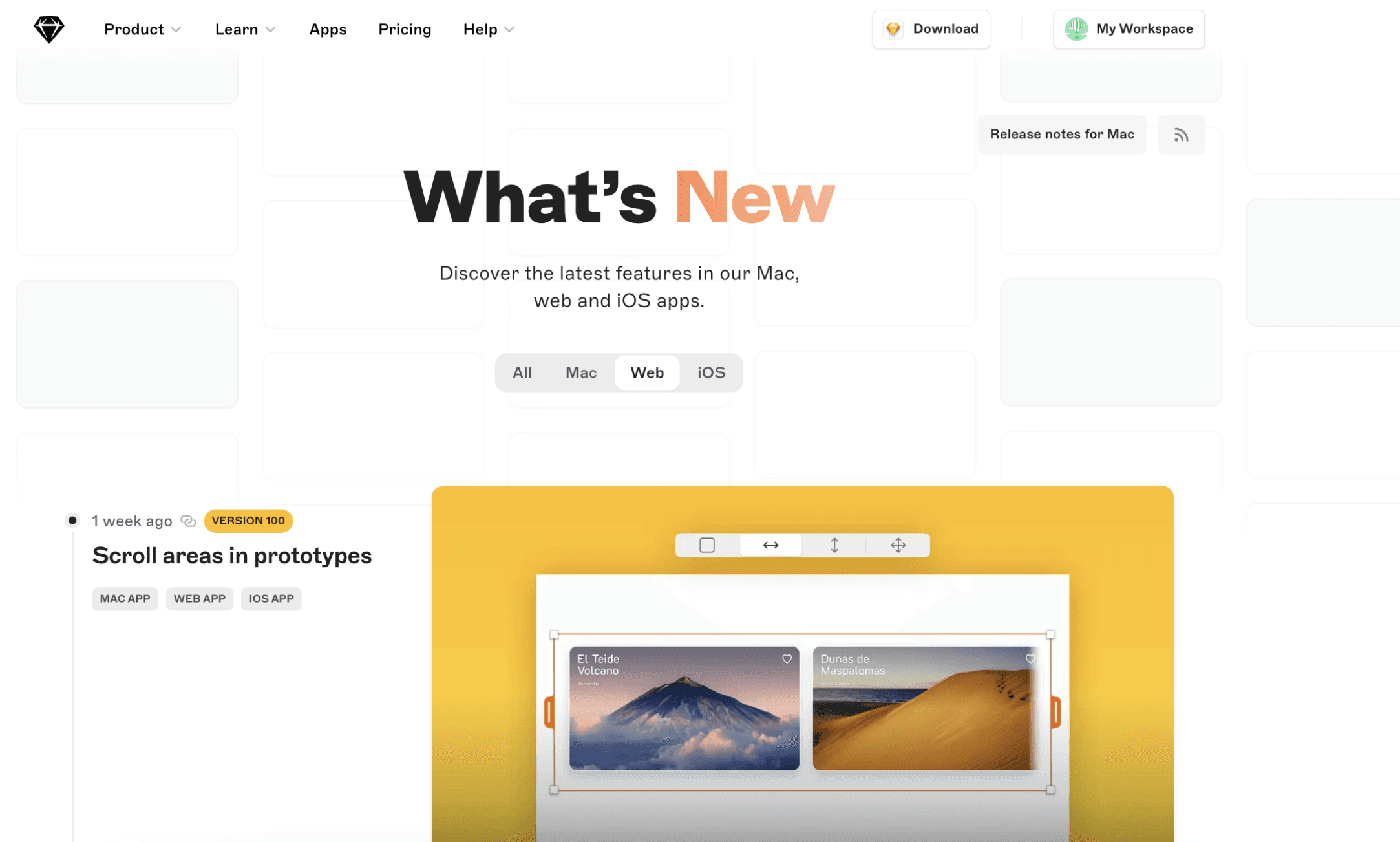
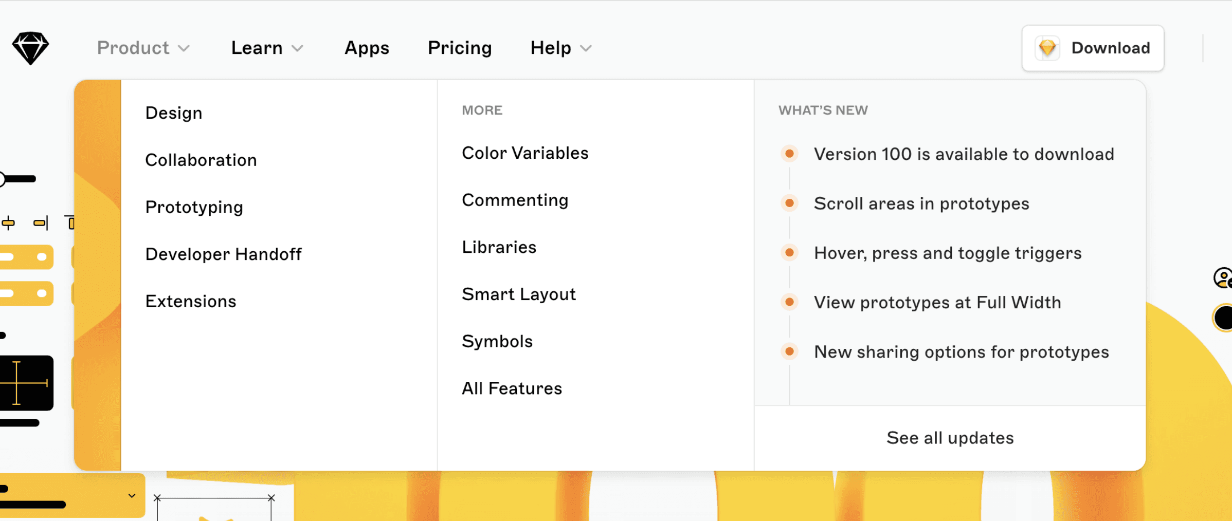
The "What's New" section is a great example of how easily it provides all updates to users eager to discover the latest features, updates, and improvements. The Release Notes for Macs is also very user-centric.
The platform filter is a nifty addition. It allows users to tailor the updates they see based on their platform, ensuring relevance and reducing information overload. This ensures users can access fresh content directly, eliminating the need to dig deep or navigate through multiple pages.
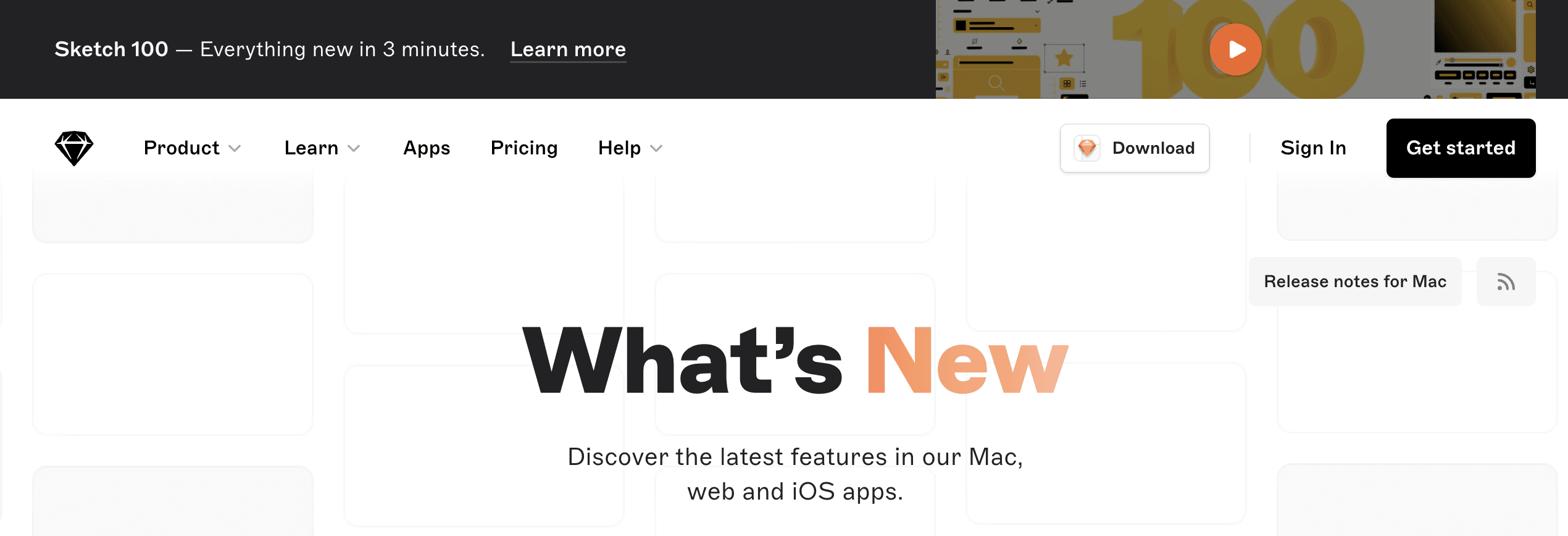
Reminder to Update to the Latest Version for New Features
The top banner on What’s New reminds users about the new version and features a two-minute video presentation that highlights all the new features, keeping users up-to-date and not to miss any improvements.
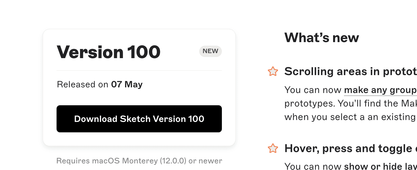
The badge on Release Notes for Mac keeps track of the current version and reminds users to update and learn more.
Clean design
Their updates are sleek, clutter-free, and totally match the clean vibe of the whole platform. It's like they designed the update info to perfectly fit in with Sketch itself.
Engaging Updates with Videos and Images
Sketch leverages visuals to elevate their release notes, making them both informative and engaging. They achieve this effect by using explanatory videos and images for all What's New updates.
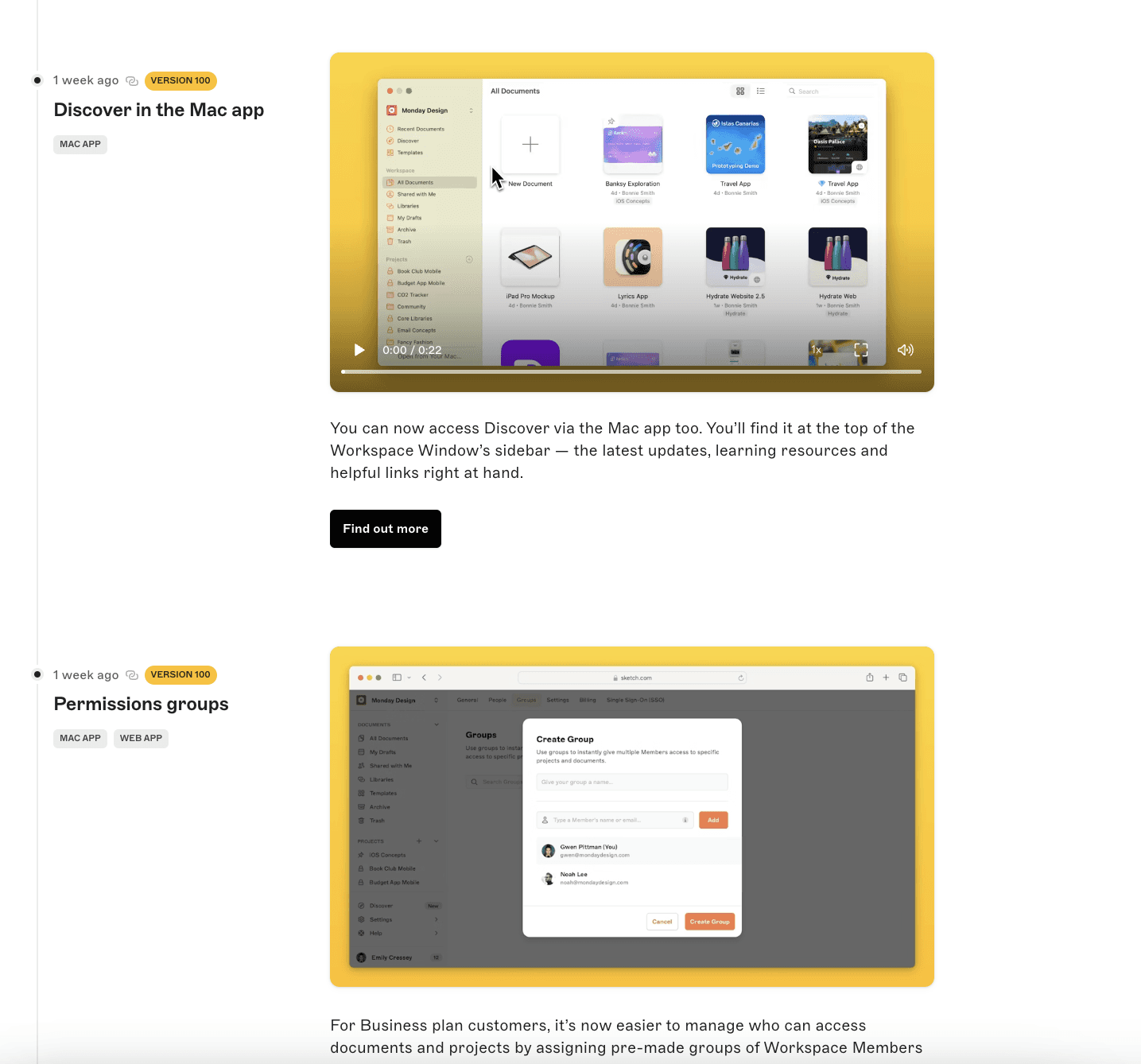
Focus on Easy User Access
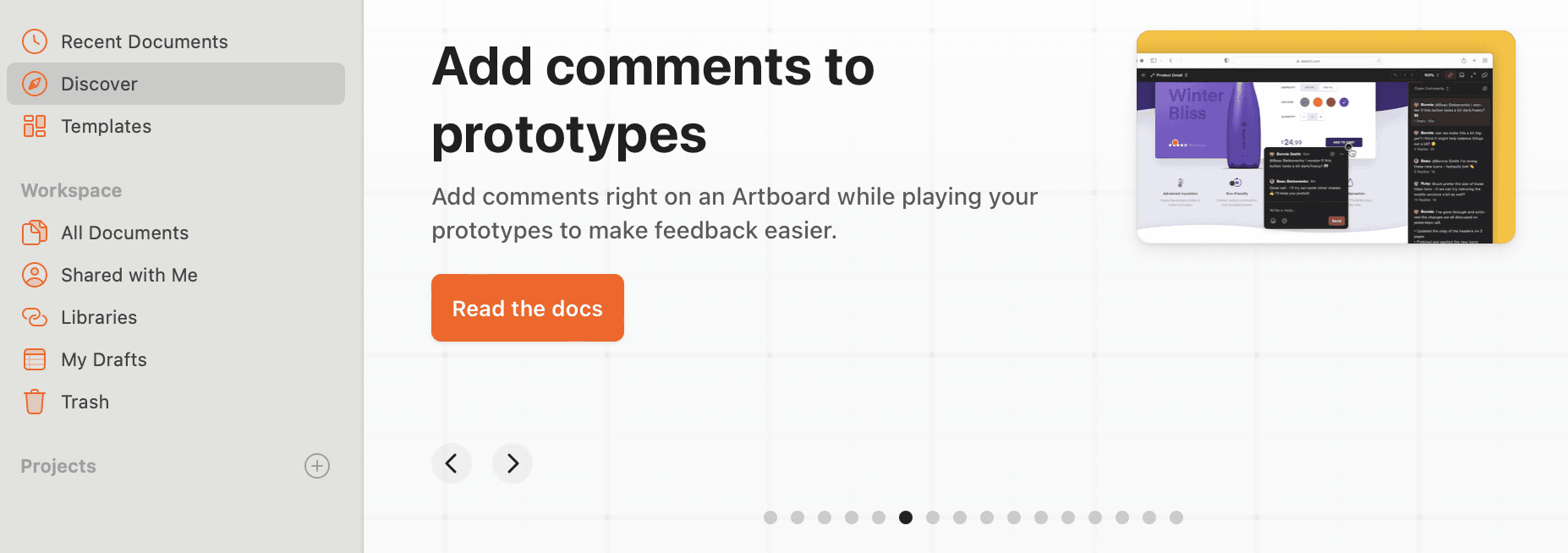
In Sketch in-app launcher and in browser application, you always have access to the What’s New section, allowing users to have a self-serve resource at all times and learn as they go.
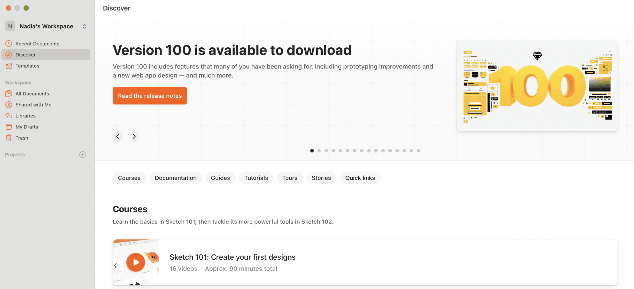
The way the new feature is represented on the main page is also very user-friendly. It resembles a timeline, showcasing the latest updates and motivating users to choose those they need.
Areas for Improvement:
Enhanced Search and Archive
The search functionality could be improved. This would allow users to easily find specific information or revisit features they encountered earlier.
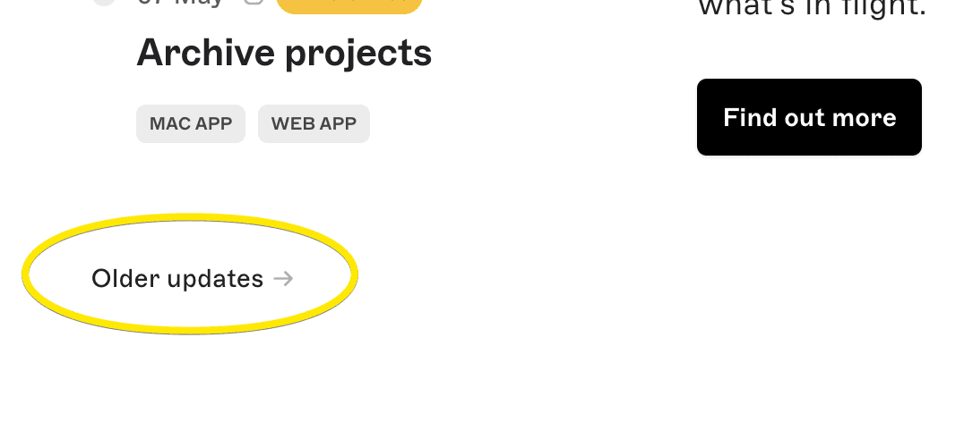
The page also features Updates archive. You can easily navigate to this section and explore the oldest updates any time. But the older updates could be listed by name, allowing users to easily access the one they need.
Spread the world about features
Sketch has a Community with likes, reactions, and discussions, along with a shareable link. It would receive more replies and comments by providing a link to the discussions near the Release note itself.
Lack of images in Mac Release Notes
While the main release notes are visually rich, the changelog feels a bit bare in comparison. Incorporating images here would offer a more holistic and engaging experience.
Conclusion
Sketch keeps things simple with clean designs, user-friendly platform filters and tags, and captivating videos to showcase updates. They don't bury you in text – you can easily find what's new and relevant to your platform. It's clear they prioritize users, making updates informative and engaging. By effectively engaging users, Sketch empowers them to take full advantage of the platform's capabilities. This user-centric approach is a great example for how release notes should be done.
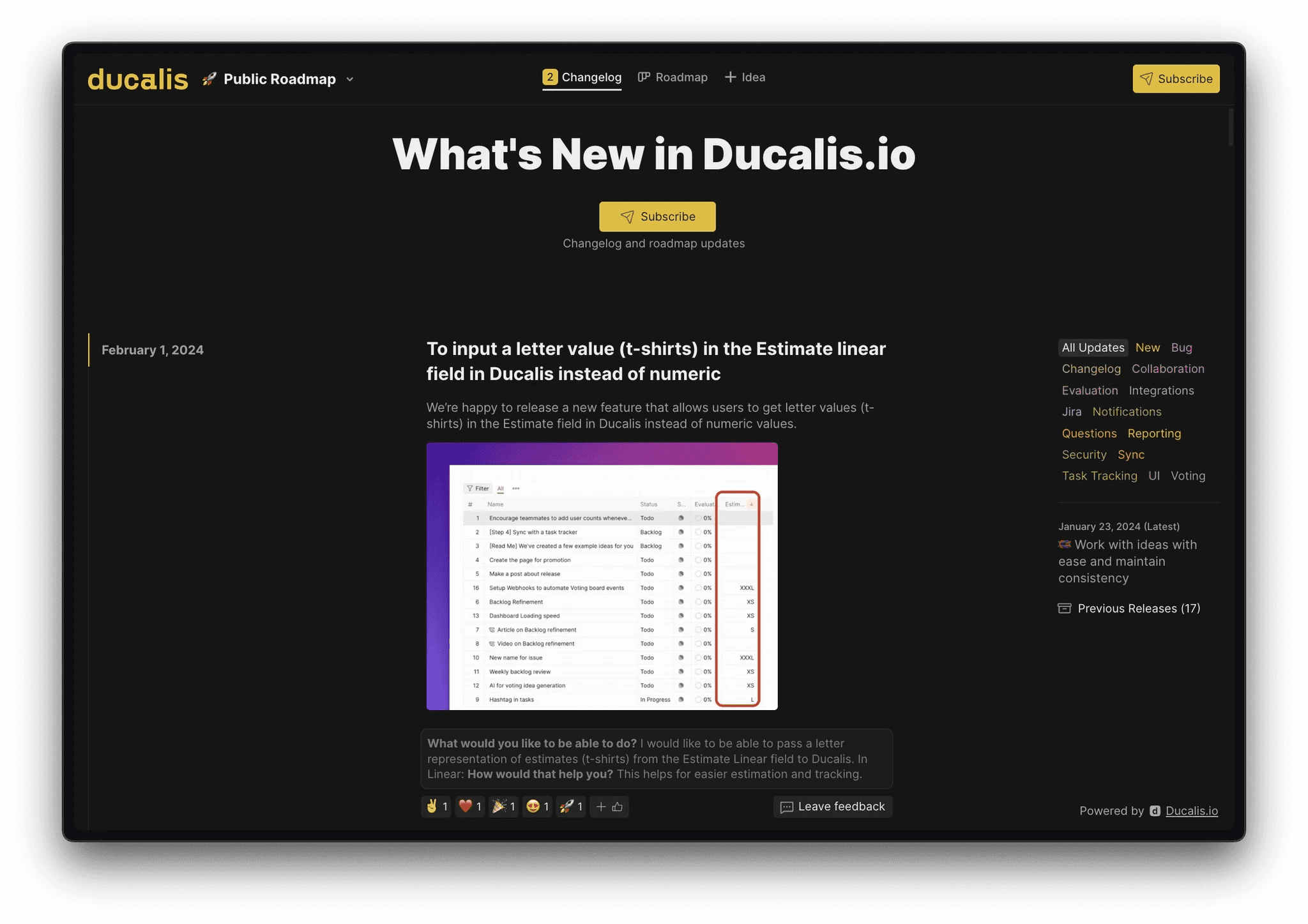
Keep in mind that with Ducalis’ changelog feature, you can automate your routine operations like writing announcements and preparing emails and pages. All of that will be done with comments and reaction features in all channels. The system will be structured with navigation and filtering options, working on mobile and desktop with no additional effort. This keeps your users informed and engaged, fostering a two-way communication flow.
Lessons to Learn:
Sketch is a popular vector graphics editor developed for macOS and Figma’s alternative. It sets a great example with its approach to release notes and changelog.
Prioritize brevity and clarity in updates
Sketch uses a friendly and helpful tone of voice. New features, improvements, experimental features, and known issues are published on average once a month.
Each update provides a clear and short description, supported by videos. Not all users enjoy reading long release notes. This page aims to keep all features in one place for easy understanding.

Provide deep links to the feature
Though Sketch feature release note has a few sentences about the feature, it serves as a clear invitation to explore, learn, and leverage the platform features. Users can access this information by following links to detailed instructions, short videos and video lessons.

Separate Release Notes by app version and platform
Sketch separates high level marketing updates from the Mac specific changelog, which contains all updates, changes, improvements and bug fixes. The updates are organized by version number, making it easy for users to find the relevant information. Unfortunately the changelog is more technical and can feel a bit "dry" due to the lack of images.

It’s also very easy to find the Release Notes for Mac only with the button, not only with a filter.

Use platform filters to simplify update searches
The "What's New" section is a great example of how easily it provides all updates to users eager to discover the latest features, updates, and improvements. The Release Notes for Macs is also very user-centric.
The platform filter is a nifty addition. It allows users to tailor the updates they see based on their platform, ensuring relevance and reducing information overload. This ensures users can access fresh content directly, eliminating the need to dig deep or navigate through multiple pages.

Reminder to Update to the Latest Version for New Features
The top banner on What’s New reminds users about the new version and features a two-minute video presentation that highlights all the new features, keeping users up-to-date and not to miss any improvements.

The badge on Release Notes for Mac keeps track of the current version and reminds users to update and learn more.

Clean design
Their updates are sleek, clutter-free, and totally match the clean vibe of the whole platform. It's like they designed the update info to perfectly fit in with Sketch itself.
Engaging Updates with Videos and Images
Sketch leverages visuals to elevate their release notes, making them both informative and engaging. They achieve this effect by using explanatory videos and images for all What's New updates.

Focus on Easy User Access
In Sketch in-app launcher and in browser application, you always have access to the What’s New section, allowing users to have a self-serve resource at all times and learn as they go.

The way the new feature is represented on the main page is also very user-friendly. It resembles a timeline, showcasing the latest updates and motivating users to choose those they need.

Areas for Improvement:
Enhanced Search and Archive
The search functionality could be improved. This would allow users to easily find specific information or revisit features they encountered earlier.
The page also features Updates archive. You can easily navigate to this section and explore the oldest updates any time. But the older updates could be listed by name, allowing users to easily access the one they need.

Spread the world about features
Sketch has a Community with likes, reactions, and discussions, along with a shareable link. It would receive more replies and comments by providing a link to the discussions near the Release note itself.
Lack of images in Mac Release Notes
While the main release notes are visually rich, the changelog feels a bit bare in comparison. Incorporating images here would offer a more holistic and engaging experience.

Conclusion
Sketch keeps things simple with clean designs, user-friendly platform filters and tags, and captivating videos to showcase updates. They don't bury you in text – you can easily find what's new and relevant to your platform. It's clear they prioritize users, making updates informative and engaging. By effectively engaging users, Sketch empowers them to take full advantage of the platform's capabilities. This user-centric approach is a great example for how release notes should be done.
Keep in mind that with Ducalis’ changelog feature, you can automate your routine operations like writing announcements and preparing emails and pages. All of that will be done with comments and reaction features in all channels. The system will be structured with navigation and filtering options, working on mobile and desktop with no additional effort. This keeps your users informed and engaged, fostering a two-way communication flow.

Get Started with Ducalis free changelog tool
We've analyzed hundreds of release notes, and one thing stands out: clear, informative changelogs lead to happier users. Inspired by the best practices in this article, Ducalis offers a free changelog builder tool:
Get Started with Ducalis free changelog tool
We've analyzed hundreds of release notes, and one thing stands out: clear, informative changelogs lead to happier users. Inspired by the best practices in this article, Ducalis offers a free changelog builder tool:
Automagical Release Notes
Ditch Manual Changelogs
save 90% time

Automagical Release Notes
Ditch Manual Changelogs
save 90% time


