Stripe Changelog Review
Stripe Changelog Review
Stripe Changelog Review
Readability
Short and descriptive titles.
Readability
Short and descriptive titles.
Readability
Short and descriptive titles.
Navigation
Useful tag filtering, short titles.
Navigation
Useful tag filtering, short titles.
Navigation
Useful tag filtering, short titles.
Frequency
One a month with a good update.
Frequency
One a month with a good update.
Frequency
One a month with a good update.
Accessibility
Excellent mobile navigation.
Accessibility
Excellent mobile navigation.
Accessibility
Excellent mobile navigation.
Actionable
All updates liked to landing pages on integration documentation.
Actionable
All updates liked to landing pages on integration documentation.
Actionable
All updates liked to landing pages on integration documentation.
Archive
All updates short and at the same landing page.
Archive
All updates short and at the same landing page.
Archive
All updates short and at the same landing page.
Based on a book Release Notes People Actually Want to Read.
If you manage a product line with multiple components or frequent updates, segmentation with tags and a user-friendly navigation system are crucial, as Stripe demonstrates. However, to truly excel, prioritize user-centric language that emphasizes the "Jobs-to-be-Done" these features solve. Additionally, don't underestimate the convenience of email subscriptions.


With its diverse product portfolio (Checkout, Fraud Prevention, Invoicing, etc.), Stripe delivers frequent updates. Their changelog system informs users with dedicated sections for product updates, API changes, and version upgrades. This review focuses on the user experience of the product changelog, highlighting its strengths and potential improvements.
Easy Navigation and Segmentation
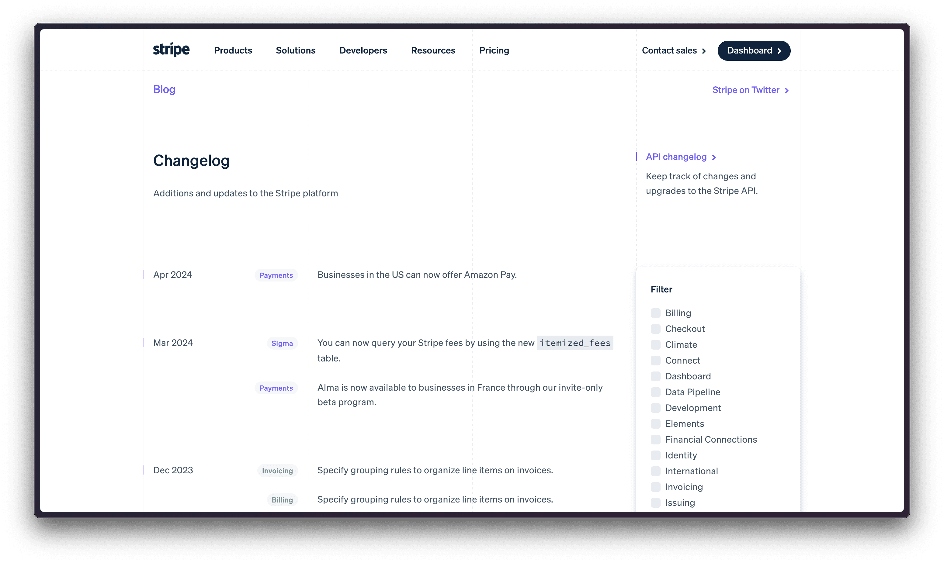
The changelog shines with its clean and concise layout. Updates are meticulously categorized by product, making navigation effortless. Short, informative titles and colorful tags allow quick scanning and pinpointing updates most relevant to your needs.

Furthermore, a user-friendly filtering option is provided for those who primarily use specific Stripe products, such as Billing or Payments.

This filter lets you focus solely on updates within those categories and provides a smooth experience even on mobile devices.

Understanding Updates at a Glance
The combination of color-coded tags and concise titles fosters rapid comprehension of updates. Within seconds, you can grasp the overall direction of Stripe's product development roadmap. Thanks to the effective use of short titles, this efficiency is further enhanced by the ability to load everything on a single page.

Areas for Improvement:
If you are targeting to have your changelog as Stripe, pay attention to these things that could make it even better.
Focusing on User Outcomes
The great changelogs help users not just learn more about new features but also understand what new abilities and powers they will get themself.
Consider these two examples:
Current: "Businesses in the US can now offer Amazon Pay."
Improved: "Increases conversions by 35% with new Amazon Pay integration."

Title from https://pay.amazon.com/
Similarly:
Current: "Alma is now available to businesses in France through our invite-only beta program."
Improved: "Increases sales in France by 10% with Alma’s pay in instalments or pay later integration."

Alma’s turnover calculator https://almapay.com/roi-calculator
There may be complexities and limitations like ‘Comscore custom study for Amazon Pay comparing conversion rates between Amazon Pay and native merchant checkouts in the U.S. over a 6-month period from October 2021 – March 2022, n=40.’
But focusing on user outcomes (increased conversions, higher sales, easy-to-go integrations) motivates users to learn more and integrate these features.
After all, easier integration with Stripe's technology translates to faster implementation and potentially more revenue for their customers, which ultimately benefits Stripe as well.
The Power of Subscriptions
Finding the option to subscribe and receive changelog updates directly in your inbox can be challenging, especially for veteran users like Ducalis, who have been using Stripe for over a decade.
Including multichannel updates, particularly email subscriptions, would significantly enhance the user experience.
Conclusion: Segmentation is Key, User Focus Reigns Supreme
If you manage a product line with multiple components or frequent updates, segmentation with tags and a user-friendly navigation system are crucial, as Stripe demonstrates. However, to truly excel, prioritize user-centric language that emphasizes the "Jobs-to-be-Done" these features solve. Additionally, don't underestimate the convenience of email subscriptions.
Ducalis changelogs offer a compelling solution, incorporating features like categorization, email subscriptions, automated newsletter with AI-writer generation with the right tone of voice for feature explanation. Consider Ducalis changelog for your needs.

With its diverse product portfolio (Checkout, Fraud Prevention, Invoicing, etc.), Stripe delivers frequent updates. Their changelog system informs users with dedicated sections for product updates, API changes, and version upgrades. This review focuses on the user experience of the product changelog, highlighting its strengths and potential improvements.
Easy Navigation and Segmentation
The changelog shines with its clean and concise layout. Updates are meticulously categorized by product, making navigation effortless. Short, informative titles and colorful tags allow quick scanning and pinpointing updates most relevant to your needs.

Furthermore, a user-friendly filtering option is provided for those who primarily use specific Stripe products, such as Billing or Payments.

This filter lets you focus solely on updates within those categories and provides a smooth experience even on mobile devices.

Understanding Updates at a Glance
The combination of color-coded tags and concise titles fosters rapid comprehension of updates. Within seconds, you can grasp the overall direction of Stripe's product development roadmap. Thanks to the effective use of short titles, this efficiency is further enhanced by the ability to load everything on a single page.

Areas for Improvement:
If you are targeting to have your changelog as Stripe, pay attention to these things that could make it even better.
Focusing on User Outcomes
The great changelogs help users not just learn more about new features but also understand what new abilities and powers they will get themself.
Consider these two examples:
Current: "Businesses in the US can now offer Amazon Pay."
Improved: "Increases conversions by 35% with new Amazon Pay integration."

Title from https://pay.amazon.com/
Similarly:
Current: "Alma is now available to businesses in France through our invite-only beta program."
Improved: "Increases sales in France by 10% with Alma’s pay in instalments or pay later integration."

Alma’s turnover calculator https://almapay.com/roi-calculator
There may be complexities and limitations like ‘Comscore custom study for Amazon Pay comparing conversion rates between Amazon Pay and native merchant checkouts in the U.S. over a 6-month period from October 2021 – March 2022, n=40.’
But focusing on user outcomes (increased conversions, higher sales, easy-to-go integrations) motivates users to learn more and integrate these features.
After all, easier integration with Stripe's technology translates to faster implementation and potentially more revenue for their customers, which ultimately benefits Stripe as well.
The Power of Subscriptions
Finding the option to subscribe and receive changelog updates directly in your inbox can be challenging, especially for veteran users like Ducalis, who have been using Stripe for over a decade.
Including multichannel updates, particularly email subscriptions, would significantly enhance the user experience.
Conclusion: Segmentation is Key, User Focus Reigns Supreme
If you manage a product line with multiple components or frequent updates, segmentation with tags and a user-friendly navigation system are crucial, as Stripe demonstrates. However, to truly excel, prioritize user-centric language that emphasizes the "Jobs-to-be-Done" these features solve. Additionally, don't underestimate the convenience of email subscriptions.
Ducalis changelogs offer a compelling solution, incorporating features like categorization, email subscriptions, automated newsletter with AI-writer generation with the right tone of voice for feature explanation. Consider Ducalis changelog for your needs.

Get Started with Ducalis free changelog tool
We've analyzed hundreds of release notes, and one thing stands out: clear, informative changelogs lead to happier users. Inspired by the best practices in this article, Ducalis offers a free changelog builder tool:
Get Started with Ducalis free changelog tool
We've analyzed hundreds of release notes, and one thing stands out: clear, informative changelogs lead to happier users. Inspired by the best practices in this article, Ducalis offers a free changelog builder tool:
Automagical Release Notes
Ditch Manual Changelogs
save 90% time

Automagical Release Notes
Ditch Manual Changelogs
save 90% time


